I know, this blog is turning from “things I learned” to “things I want to complain about”, but just look at this:
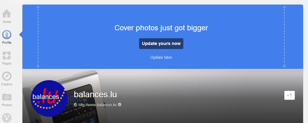
Cover photos on google+ just got bigger. Great! What for? I don’t know yet. What looks really bad though is the new round shape of the profile photo (or in this case, the logo) and there’s no option to say “not now” there.
Sudden changes like these are a good reminder that you’re not really in control of your g+ or facebook pages, YouTube channels, Amazon listings, etc. You’re just a guest and if the owner suddenly thinks that your face appear in a circle, well, you better get used to it.
Edit: The new size seems to be 925 x 522 pixels.
Update March 16, 2013: Here’s a great example of what to do with the new giant header (don’t click if you’re on a slow or expensive connection).
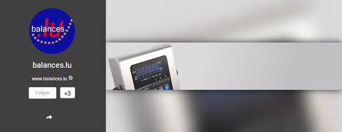
Update November 15, 2013: Big cover photos are soooo March 2013! Now they’re smaller again:
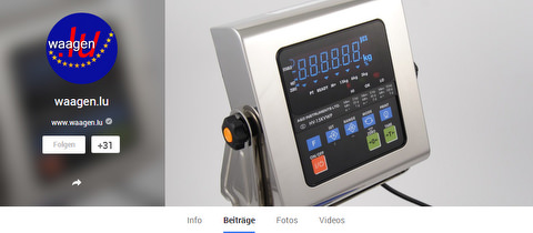
Not too bad. However, if you never made your cover photo bigger in the first place it looks rather stupid now:
For a while, I thought g+ could be a viable alternative for small business owners who can’t afford their own website (which according to recent and now deleted Craigslist rant, should cost at least US$1500, no matter how simple it is). However, with so many seemingly unnecessary design changes I’m not sure this is still something I’d recommend.