Adsense referrer spam?

I made a whopping 0,12€ with ads on this blog over the last 30 days (and just disabled them entirely, don’t want to get corrupted by all that money). However, what really caught my attention in the report was a domain that doesn’t belong to me (or my company):

Adsense Referrer Spam

So, apparently t****4web.com used my Adsense code on their site, resulting in a single ad impression (and nobody clicked on it, otherwise, my ad revenue would have been at least three two times bigger). How and why did this happen?

The innocent explanation is that their “Web Back Machine” (which sounds suspiciously similar to the non-profit Wayback Machine) archived one of my pages, including the Adsense ads. That’s possible, but what is more likely it that this is Adsense referrer spam, meant to get me to visit their website. I’ve got to admit that it worked, so now I have to write this blog post to justify my actions to myself, see, it was all in the name of research.

For further information on Adsense referrer spam, let me refer you to this comprehensive, well-written article.

g+ cover photos just got bigger

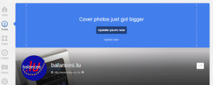
I know, this blog is turning from “things I learned” to “things I want to complain about”, but just look at this:

Don't like it? Move out!

Cover photos on google+ just got bigger. Great! What for? I don’t know yet. What looks really bad though is the new round shape of the profile photo (or in this case, the logo) and there’s no option to say “not now” there.

Sudden changes like these are a good reminder that you’re not really in control of your g+ or facebook pages, YouTube channels, Amazon listings, etc. You’re just a guest and if the owner suddenly thinks that your face appear in a circle, well, you better get used to it.

Edit: The new size seems to be 925 x 522 pixels.

Update March 16, 2013: Here’s a great example of what to do with the new giant header (don’t click if you’re on a slow or expensive connection).

Update November 15, 2013: Big cover photos are soooo March 2013! Now they’re smaller again:
G+ cover photos version 2 to version 3

Not too bad. However, if you never made your cover photo bigger in the first place it looks rather stupid now:

G+ cover photos version 1 to version 3

For a while, I thought g+ could be a viable alternative for small business owners who can’t afford their own website (which according to recent and now deleted Craigslist rant, should cost at least US$1500, no matter how simple it is). However, with so many seemingly unnecessary design changes I’m not sure this is still something I’d recommend.

Bye bye, Moneybookers (Skrill)

I had such high hopes for you, thought you might grow up to challenge PayPal. I soon realized that you were special. Your special SMS verification lead to a number of complaints from customers who claimed they’d never received your message. Those special “ISO” country codes you used in your merchant gateway forced me to write a function with the sole purpose of converting actual ISO 3166 codes to your system. There’s also the special way you treat refunds by keeping the original transaction fees.

Then came Christmas 2004 and it seemed like everyone suddenly wanted a digital scale. Our business took off, but you were skeptical and refused a large number of transactions. Our customers sent us angry emails asking why their credit card worked everywhere else but not with us. I apologized and asked them to use PayPal instead. Almost all transactions went through just fine and none turned out to be fraudulent.

After this disappointing experience I quickly signed up with Worldpay but still kept you around as a payment option for customers who already had a Moneybookers account. Very few did. This year, only one customer used your service.

Eventually, you decided you had to change. You gave yourself a new name (Skrill). You informed me about a new inactivity fee for merchant accounts and started charging a monthly gateway usage fee. Your new name suddenly made sense: Like a whale filtering krill out of the ocean, you wanted to become incredibly fat by feeding on millions of users.

Thankfully, you made it easy to close my account. Best of luck in your future endeavours.

eFax reviews and alternatives

eFax reviews make “Hotel California” look good

Before signing up with eFax, do yourself a favor and read the reviews on websites like epions.com, yelp.com or viewpoints.com.

From my own experience I can confirm that it is difficult to cancel your account with eFax. You also have to be careful if they offer you a more reasonable rate: In my case this rate reverted back to the original rate after 4 months. The customer service representative admitted that “he didn’t know about this” and offered to reactivate the cheaper rate for another four months. At this point I asked him to cancel my account instead, which he pretended to do after asking for my PIN. Unfortunately, eFax kept charging me and when I complained by email, I was told that my account had never been cancelled and that I had to call them again (which I just did). This time I had a witness listening to the conversation and wrote down the name of the person I talked to (she essentially refused to give me her last name, claiming there was only one person with her first name working there). If they still keep billing me I’ll simply ask my bank to do a chargeback.

I’d also like to point out that eFax sends you every received fax by email (as an attachment, in addition to letting you download it through the message center). While this is certainly convenient, it may be a serious security risk if a fax contains sensitive data. Unencrypted emails are about as secure as a postcard. Some people prefer to send a fax precisely because they do not want to send an (unencrypted) email. Having eFax transform faxes into an emails is not a good practice.

eFax alternatives

There are a lot of companies offering similar (or even better) services for fax sending and receiving. I eventually signed up with PamFax not only because they were cheaper, but mostly because they make it very easy to cancel your account. They also never send the actual fax by email, you only get a notification and then download the fax over a secure connection (SSL)  Your fax is now sent as an attachment, though you can change this under Account>Notifications1. PamFax allows you to integrate your account with Skype, Facebook, Salesforce, Box.net, Dropbox and Google Docs (to varying extents) and their modern website makes eFax look really dated.

Finding reviews for Pamfax was a bit difficult. There are a few confusing reviews in the Skype apps shop. As the service is run by a German company, you can also find some user reviews in German on heise.de (currently 8 reviews with an average of 4 stars out of 6).

Personally, I’m very satisfied with PamFax so far.

Another online fax service I found was PopFax. If you know any other eFax alternatives, please leave a comment.

Here’s another option: If you own a Fritz!Box, that might be all you need to receive and send faxes. However, I found that the integrated Fritz!Box fax was clearly less reliable than an actual fax machine.

Update October 2nd, 2012: HelloFax.com is one more alternative I just found (didn’t try it out though, still very satisfied with PamFax).

Update January 16th, 2013: Simple-Fax.de is yet another service (apparently only available in German). 1I’ve also updated the description for PamFax above.

Update August 17, 2016: InterFAX is not just another alternative to eFax, but also has a Fax API which could be very interesting for developers.

This is what happens when your website sucks

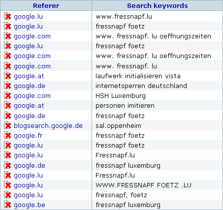
Here’s the first page of “search hits” from my three private blogs (hypermegaglobal.net, meltdownblog.com and krise.hypermegaglobal.net – all updated much more frequently than this one):

Search hits and keywords
All of these are from today

As you can see, most of my visitors where looking for fnapf, which is a pet supply franchise chain. That’s because I blogged about how badly fnapf‘s Luxembourgish website sucks. Not only is it configured in a way that omitting the “www.” will get you nowhere, even if you make it to their website it’s difficult to locate their biggest store unless you know where to find it on a map (or keep zooming out). This quickly became the most popular post on my blog (pathetic, I know) which means that I’m obviously not the only one who had trouble finding what I wanted on their site.

So here’s a quick reminder of the very basic content you should put on your website (examples are geared towards a brick and mortar store).

The 5 friggin’ Ws – things you should definitely put on your website

Let’s simply take the well-known 5 Ws from journalism and reinterpret them from the perspective of a website visitor looking for information (which should also get us pretty close to the perspective of a search engine trying to determine your website’s ranking). Apparently these basics are so obvious that they’re often forgotten (either that or many people just have no clue of what to put on a website).

Who?

Who are you? Example: We’re “Zombie Megastore”, Luxembourg’s leading store for all you zombie needs.

What?

What exactly is it that you do? Example: We carry a large selection of… well, maybe I shouldn’t have chosen the zombie store example. Anyhow, here’s where you list the things customers can find in your shop so that 1. they’ll find you when searching for your city + a certain item or brand on a search engine and 2. they don’t have to call and ask if you sell product XYZ item before taking the trip to your store.

When?

Opening hours. If you’re closed on certain days, put this on your website. If you’re closing your shop for vacation, put this on your website (yes, I’m looking at you, Luxembourgish shop and restaurant owners who like to take long summer vacations).

Where?

Your address (you might want to include your phone/fax number, email, link to contact form, etc.).

Why?

This is the place where you might think you’ll have to come up with a wonderful story to justify why you’re doing what you do (“when my grandfather turned into a zombie, I realized there was no shop where I could buy thinks to make his… uhm… ‘life’ just a bit better”). That’s cute, but I suggest staying with the customer perspective and just answering the old basic “why should I buy from you”-question. It can be as simple as “we are the biggest store for zombie supplies in the entire state”.

That’s it, the basics. Of course a website can do much more than just answering these questions, but not answering them means you’ll lose potential visitors/customers every day.