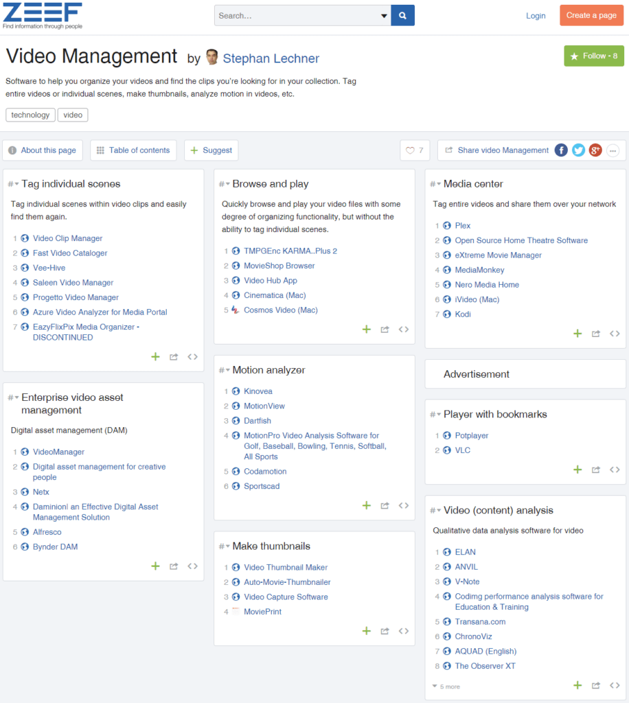
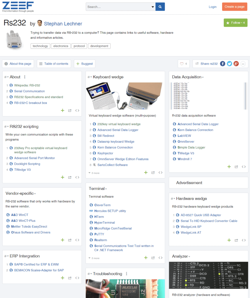
Zeef.com is (was?) a curated directory where users could create organized lists of links. I used it to make pages about video management software and RS-232:
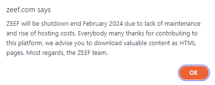
If you visit zeef.com right now (February 29, 2024), you’ll see a popup announcing that the site will be shut down:
Although I wasn’t notified by email, the shutdown didn’t come as a complete surprise to me. Zeef apparently struggled to attract a large user base. Moreover, it suffered from frequent outages recently. Still, it’s sad to see it go.
I will be uploading my pages to this blog. If you’ve missed the chance to download your pages, you can probably still find them on the Wayback Machine (Internet Archive).
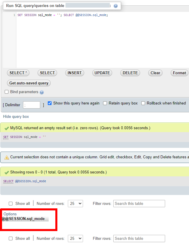
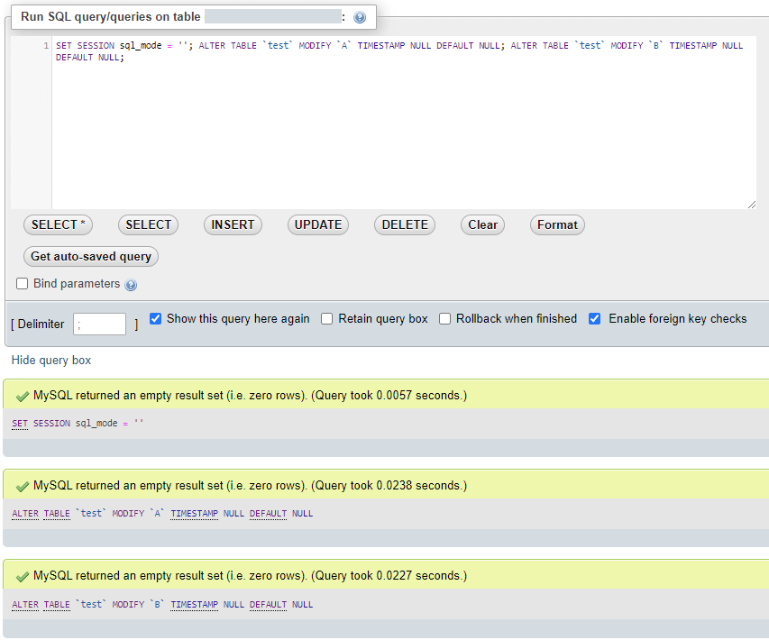
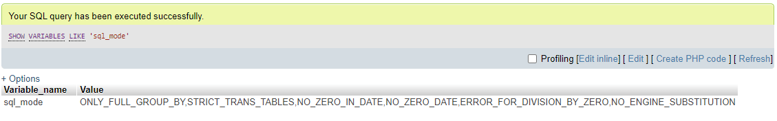
Pre-pending the query with SET SESSION sql_mode = ”; worked for me:
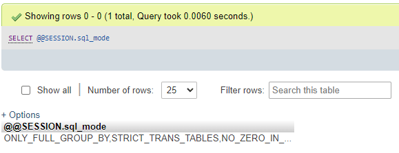
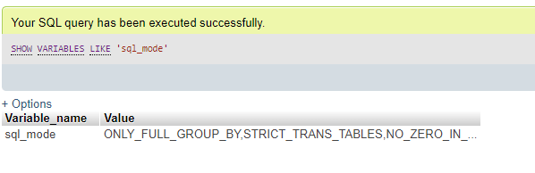
Note that executing multiple queries separately did not work. Here I ran SET SESSION sql_mode =” first and then SELECT @@SESSION.sql_mode, which showed that strict mode was still active:
Example
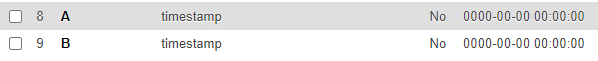
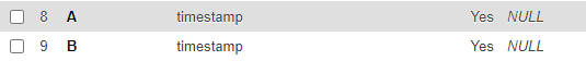
After the update of a MySQL server on a shared hosting account, strict mode was enabled with the NO_ZERO_DATE option and there was no way to change this. This meant that – among other things – I had to remove a default timestamp value of “0000-00-00 00:00:00” from multiple columns:
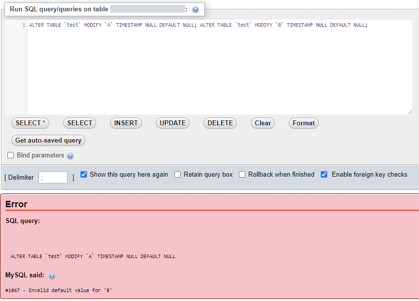
However this failed with error #1067 as other columns still used this invalid default. In other words, altering column A to make it compliant failed as column B was not compliant yet:
I’m not sure what the reasoning behind this is. However, temporarily disabling strict mode by pre-pending the query with
SET SESSION sql_mode = '';
let me make the necessary changes:
Result:
While this probably comes too late to help Pete, I hope it can help you.
Window shadows are much larger under Windows 11 than under Windows 10. This can be an issue if you need to take screenshots, but don’t want to waste so much space on shadows. Simply cropping the screenshots is not a very aesthetically pleasing solution.
Solution 1: Use Alt+PrintSc
To quickly capture a screenshot of your active window without the shadows, press and hold the ‘Alt’ key, then hit the ‘PrtScr’ (or ‘PrtSc’) key. This will immediately capture a shadow-free screenshot of the window and copy it to your clipboard.
Solution 2: Temporarily disable shadows under windows
The simple solution above does not work for more complex scenarios, such as multiple windows in a single screenshot, or when you want to include tooltips.
For these cases, you can disable shadows under windows temporarily.
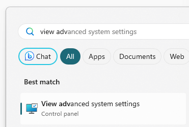
In the start menu, start typing “view advanced system settings” and then click on the best match:
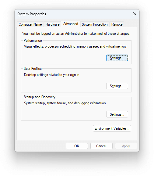
Click on Settings under Performance (in the Advanced tab):
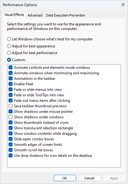
Uncheck “show shadows under windows”.
If you’re looking to disable shadows for a brief period, click Apply. This will disable the shadows but keep the dialog box open for you to easily revert to the original settings:
If you want to keep the shadows disabled for a longer time, click OK.
You can now use PrintSc or Windows+Shift+S to capture a screenshot.
Recording a message, even in a single language, can be difficult. Many of us cringe at the sound of our own voice played back to us. Furthermore, it takes practice to record a message without interruptions while maintaining a steady pace and clear enunciation.
The complexity multiplies when you’re looking to create a multi-lingual answering machine announcement. Fortunately, AI is making this a lot easier than it used to be.
Write the text for the announcement
An answering machine on a FRITZ!box typically allows you to record 3 types of messages:
A greeting for the “Record messages” operating mode.
A “goodbye message” that plays when the caller reaches the maximum recording time.
An announcement for the “Greeting only” operating mode, where callers cannot leave a message.
Start by writing the message(s) in your native language. If you’re not sure what to write or if you want to be particularly funny or obnoxious, you can always ask ChatGPT for help. Here’s a suggestion:
Translate the announcement
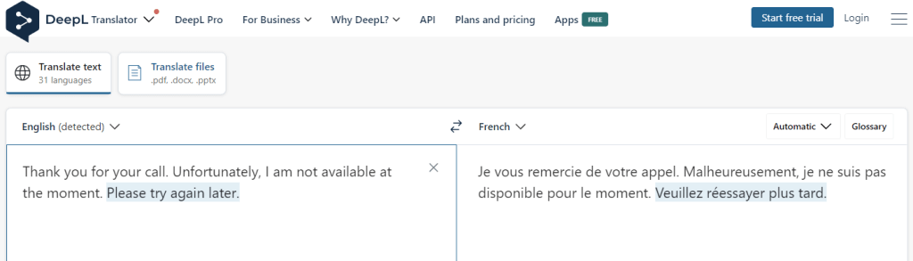
If you need help with the other language versions, use DeepL translator, Google Translate or similar websites to translate the text:
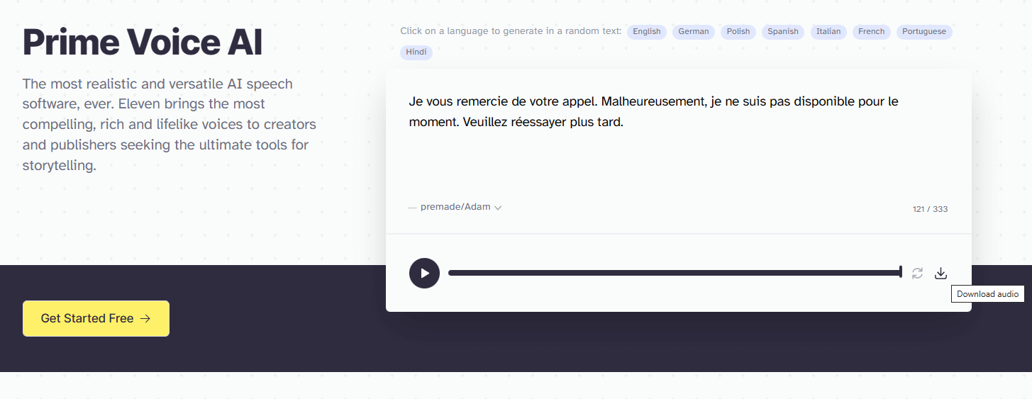
Use ElevenLabs Voice AI for voice synthesis
If you want your announcement to sound like a robot, click on the speaker icon in Google Translate and record the output (actually it does not sound that bad anymore, so this may have become a viable option). However, for the highest-quality, human-like voice synthesis and a choice of different voices, there’s currently no better option that Prime Voice AI by ElevenLabs.
In my experience, some voices sound better for certain languages than others. However, Prime Voice AI is evolving rapidly, so I won’t go into details as they will be quickly outdated.
Download recordings of your translated texts in all the desired languages (these will be MP3 files):
Notes:
If you’re creating an announcement for personal rather than business use, consider making it clear to the caller that they’ve reached the right person, even if the recording doesn’t sound like you. On the other hand, if you like to confuse people, this could be a great opportunity.
ElevenLab’s free plan requires “attribution to elevenlabs.io”, though I’m not sure how this would work with a pure audio recording. Perhaps you could incorporate it into your message, something like: “This is Adam from Elevenlabs.io. I’m sorry, but <your name> cannot pick up the phone right now…”
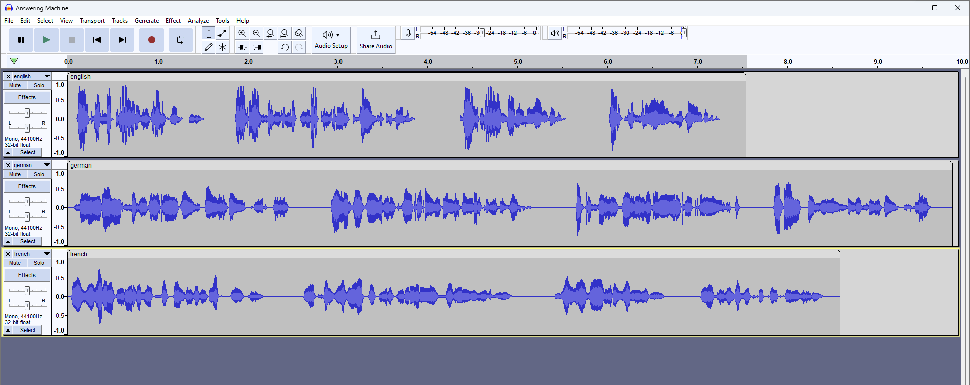
Processing the audio files in Audacity
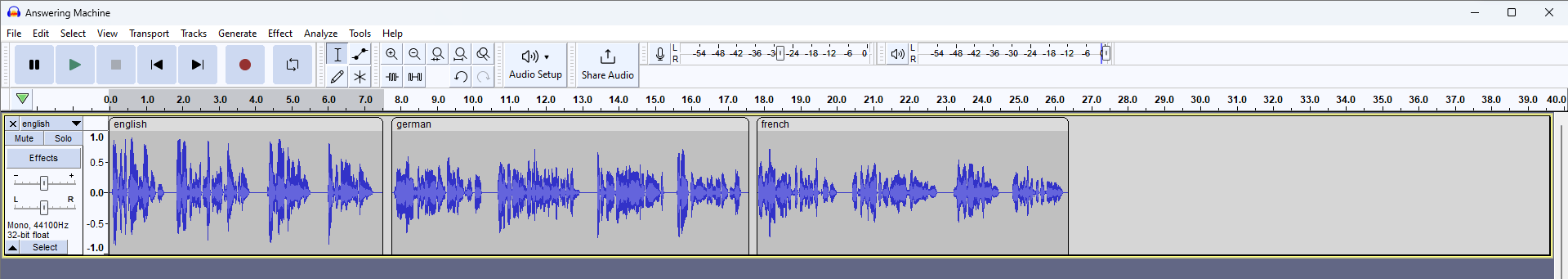
Open Audacity and drag-and-drop the MP3 files you downloaded from ElevenLabs. They will appear as separate tracks:
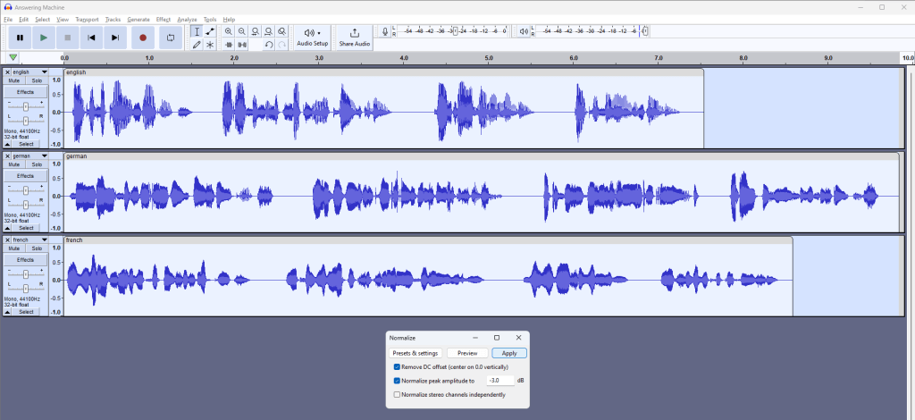
Normalize the clips (when using different voices)
If you notice a significant volume discrepancy between the tracks, normalize them first to even out the volume levels before you combine them. Normalizing will ensure that each individual track reaches its maximum volume level without distortion.
Press Ctrl+A to select all the tracks or go to “Select” > “All”.
Go to “Effect” > “Volume and Compression”> “Normalize”.
I’ve found that the normalizing to -3.0 dB works well for the FRITZ!box. Click “Apply”.
Move the clips to one track
You may want to “Zoom out” (Ctrl + 3) to make this easier. Then grab the clip you want to move at it’s light-colored area at the top and drag it onto the top track (behing the clip that is already on the track, leaving some room for a pause, if required). Repeat this process for the remaining clip(s).
If you want, you can now delete the empty tracks by clicking on the ‘x’ at the top left of each track.
Export in the best format for the FRITZ!box answering machine
Your FRITZ!Box will likely prefer recordings in WAV format, 8000 Hz, 16-bit, and mono. However, it’s best to confirm this in your device’s manual or the FRITZ!box knowledge base.
The MP3 file downloaded from Elevenlabs should already be mono. If not, go to “Tracks” > “Mix” > “Mix Stereo Down to Mono”.
When exporting the file as “WAV (Microsoft) signed 16-bit PCM”, Audacity automatically converts the bit depth to 16-bit, regardless of your project’s current setting. So, there’s no need to change this.
However, we need to change the sample rate to 8000 Hz. One way to do so is by resampling the track:
Go to the “Tracks” menu at the top of the screen.
In the dropdown menu, select “Resample…”.
In the “Resample” dialog box that pops up, enter “8000” in the “New sample rate (Hz)” field.
Click “OK” to apply the changes.
Now, you can listen to the announcement at the much lower sample rate to get an idea of how it’ll sound to your callers.
Finally, go to “File” > “Export” > “Export as WAV”. In the dialog box that appears, enter your desired file name, make sure “WAV (Microsoft) signed 16-bit PCM” is selected as the type, and click “Save”.
If you also want to preserve your Audacity project file, press Ctrl + S or go to “File” > “Save Project”.
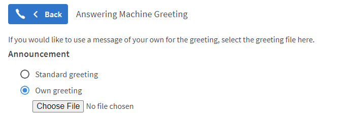
Import the audio file into your Fritz!box
The process of setting up an answering machine on your FRITZ!Box may vary based on your specific model and firmware. However, within the answering machine’s settings, you should find an option to use your own announcement instead of using the standard greeting. Here, choose the .WAV file that you exported from Audacity:
For further information, please search for “Configuring Your Own Greetings” in the FRITZ!box knowledge base.