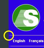
First time I noticed this: The div with the logo and the language selection div below have a 10px solid left border in blue (matching the background color) and a 1px white bottom border, which leads to a nice gradient in Firefox 3:

Nice, though I wonder if this behaviour can be influenced. In IE, Firefox 2, Opera and Safari it looks like this:

(Before you mention it, I know the language names lack padding in the lower screenshot – my mistake, but unrelated to the issue at hand)