Update: Heise made some modifications while I was writing this post, so not everything below still applies.
It’s summer time in Europe, many people are on vacation, others are distracted by the Olympics – if you were planning something outrageous, now might be a good time to get away with it. No, I’m not talking about Georgia, I mean the redesign of heise.de, Germany’s IT website no. 1.
Heise.de went from a table-based, liquid layout to a xhtml 1.0 strict compliant fixed width (elastic) layout. I don’t think anyone complained about the xhtml compliance, the key here is “fixed width”. Yes, I know. Discussed to death. In the left corner, we have “long lines are hard to read” and “fixed width gives you better control over the layout, making it easier to design visually appealing sites for lazy designers like me” whereas in the right corner we have “liquid layouts adapt to all sorts of different screens, which is what the internet is all about” and “if I believe the lines are too long I can resize my viewport myself, thank you very much”. I can’t tell you who’s right (because it’s one of these annoying “many shades of grey” topics) but what I can tell you is that switching from one camp to the other is going to make many people unhappy. Very unhappy.
2 billions. That’s the number of unhappy comments in heise’s discussion forum. Ok, it’s more like 5000 and only about 90% of those express disapproval. Still, even if you consider that the heise forum is most likely the place in cyberspace with the highest concentration of negativity, that’s a lot of unhappiness.
Is it justified? Well, judge for yourself. Or just let me tell you: yes! Let’s have a look at how they messed it up:
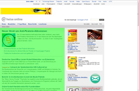
This is how the website now looks on my not-so-gigantic 1280×1024 screen. I took the liberty of highlighting the actual content, squeezed in the lower left corner. Some people on the forum are already complaining about a stiff neck from looking to the left all the time while others don’t like the content being so close to the end of the world edge of the screen:
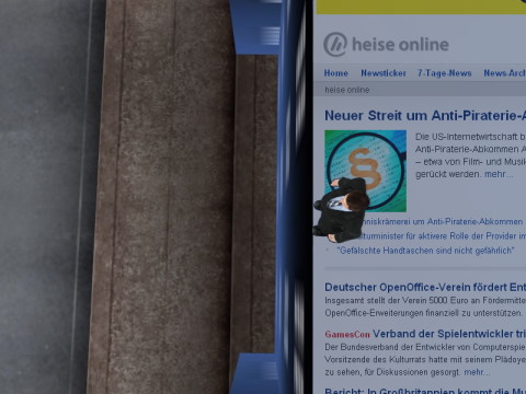
What I dislike most is the odd combination of a centered upper navigation bar with a main content area justified to the left. It makes me feel seasick:
There’s also the large unused white area to the right which is making readers nervous because they expect annoying flashy ads to appear at any time (the medical term is “ad premonition disorder”).
Having studied 2534523 comments, I managed to identify certain patterns in behavior:
- “It’s not a problem if you can fix it”: These folks suggest you manipulate the css to get the beloved liquid layout back. They probably use Linux, so they’re used to fixing everything they don’t like.
- “Couldn’t you give users an option, maybe a switch in their profile which would let them choose their preferred layout? Hey, I might even be willing to pay for it”: Windows users.
- “You’re not supposed to expand your browser to the full size of your monitor. A good OS wouldn’t encourage you to do this!”: Smug Apple 30″ cinema display owners.
- “I hate you and I’m not coming back… at least not until tomorrow, but I’ll just return to see if you changed the design back and to post angry comments if you didn’t”: They’ll never leave and they know it.
- “Hey, finally something I can write about in my blog!”:Yeah, that’s… uhm… me.
This would normally have been the end of this post, except that I had an epiphany when I turned my monitor by 90° (it’s fixed on an Ergotron monitor arm and my graphics card supports this, too). This changed everything! All those print media sites like SPON, sueddeutsche.de, faz.net and even wort.lu suddenly looked great! I wonder why…
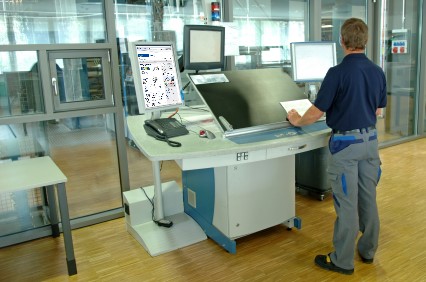
“Hey, it looks good on my screen!” (the one on the left). 😉


