Content-aware resizing of pictures (seam carving)

I’m not sure why golem.de published an article on Seam Carving GUI (open source) today (maybe they have a selection of emergency posts for slow news days πŸ˜‰ ), but I’m glad they did because I had no idea something like this even existed.

If you have no idea of what I’m talking about, take a look this video:

Ever been in a situation where you had a picture with exactly the content (“message, meaning, …”) you wanted, but not with the right dimensions? Seam carving could have saved the day.

I used it for a stock photo today which just had to be 550×225 pixels to fit in a template (sorry, can’t post the picture because I’d have to pay for the rights again – I’ll post a link when it goes online). It worked extremely well because the important objects did not stretch along the entire length of the picture. The sky and mountains in the background were resized in a way which made it look as if the photographer had used a wide-angle lens.

Encouraged by my success, I decided to try something extremely challenging. Here’s a photo of me on the balcony of a hotel (it just looks as if I was trying to log into unprotected wireless networks – actually I was enjoying the sunshine and fresh air):

The picture above is 480 x 360 pixels. Let’s say I want to keep the width, but reduce the height to just 220px. Usually, this would mean cropping:

Notice that the top of the other buildings and the horizon is no longer visible.

With seam carving, you can keep all of this in the picture (also, it now looks as if I had a widescreen laptop):

As mentioned, this is an extremely challenging picture. Regular shapes are all over the place and if you look closely, you’ll find at least one odd area which would be noticeable even if you’d never seen the original picture (windows on the red building). Still, considering the difficulty, the software does an excellent job. You could fix the most noticeable problems in a minute in an image editor:

Pretty neat. I’m really looking forward to seeing what else will be possible with a few mouse clicks in the near future.

Here’s some additional info I scraped from the comments at golem.de:

  • If you’re using gimp, here’s a plugin for you.
  • Photoshop CS4 can do it, too (it’s called content-aware scaling)
  • For fancy online retargeting (how many names are they gonna give this?), check out rsizr. While I liked the animation, the result wasn’t that convincing (I guess it’s art):

If you still haven’t done so, go get Seam Carving GUI and have fun (did I mention it’s free and available for Windows, Mac OS and Linux?).
Websites with and without ‘www’

Double-u double-u double-u is one of the few things you can say much faster if you say it in German (just say “v v v”). I’m German, so I continuously strive for efficiency (nah, possibly I’m just lazy), which is why it annoys me that I still have to type “www” in front of some domain names to get to the desired website!

I mean, it’s 2008, the World Wide Web has been around for a while, so please, dear webmasters, could you make sure that your website works as http://www.example.com and http://example.com?

Here’s a list of offenders from the past few days (off the top of my head):

Now before you leave a comment and say “why don’t you just use bookmarks or press Ctrl-Enter in Firefox”, let me point out that there’s more to consider: If you can actually reach the same content with and without “www”, so can the search engines. Different URIs for the same resource might mean trouble (“duplicate content”).

AFAIK, the best way to handle both issues is a 301 (permanent) redirect. On Apache, make sure the domain with and without “www” points to the same directory and place an .htaccess file with the following content there (requires mod_rewrite):

RewriteEngine On
RewriteCond %{HTTP_HOST} ^example.com$ [NC]
RewriteRule ^(.*)$ http://www.example.com/$1 [R=301,L]

This will redirect users to URL with “www”. BTW, this code was taken from the excellent book “Building Findable Websites: Web Standards SEO and Beyond” [affiliate link]. It also has a chapter about weblogs which I think I should read. πŸ˜‰

How long would it take you to notice that your website has been compromised?

My last post concerning mass sql hacks of websites shows what can happen if your website is distributing malware and you don’t act fast enough. In that post, I also mentioned it might be a good idea to have some sort of self-checking mechanism integrated in your CMS which would alert you if unauthorized changes were made. While I still think that’s a good idea, there’s a much easier and faster option when it comes to small, rather static websites: change detection services!

Here’s a few I found through search engines, a blog post from 2005 by Marshall Kirkpatrick and an article in c’t magazine 4/2008 (page 170):

ChangeAlarm – free, typically checks for updates once per day

ChangeDetect – free and paid membership options

ChangeDetection – free, typically checks for updates once per day, does not detect changes in HTML tags

InfoMinder – no free membership, 30 day trial available

TheWebWatcher – free for personal use, monitoring intervals starting from 1h

TracerLock – no free membership, max 20 URLs, 4 US$/month

TrackEngine – free, 19,95 US$/year for 10 “bookmarks”, 4,95 US$/month for 50 “bookmarks”, possibly includes more frequent updates for paid services

WatchThatPage – free, priority accounts available for donation of US$ 20/year. Fastest update: once per day. There seems to be no limit on the number of pages you can watch. Pages can be organized in folders. Simple keyword filtering available. Refuses to watch pages with badly mangled HTML.

Yes, I know, most of these sites scream “web 1.0” at you and – ironically – seem to be averse to change themselves (the latest news on TrackEngine are from December 2001, Merry Christmas!). They won’t really help if you’re in charge of large websites with thousands of pages. However, they might be appropriate for small websites, like this one which has been displaying “OwNed By un alien …” for months on the “liens” and “evenements” pages.

I’ll update this post after trying out some of these services (you can subscribe to my RSS feed here πŸ˜‰ ). Please note there’s also tons of change detection software (running locally on your computer) which I’m not covering here.

Chiropractors “very satisfied” with heise.de redesign

Update: Heise made some modifications while I was writing this post, so not everything below still applies.

It’s summer time in Europe, many people are on vacation, others are distracted by the Olympics – if you were planning something outrageous, now might be a good time to get away with it. No, I’m not talking about Georgia, I mean the redesign of heise.de, Germany’s IT website no. 1.

Heise.de went from a table-based, liquid layout to a xhtml 1.0 strict compliant fixed width (elastic) layout. I don’t think anyone complained about the xhtml compliance, the key here is “fixed width”. Yes, I know. Discussed to death. In the left corner, we have “long lines are hard to read” and “fixed width gives you better control over the layout, making it easier to design visually appealing sites for lazy designers like me” whereas in the right corner we have “liquid layouts adapt to all sorts of different screens, which is what the internet is all about” and “if I believe the lines are too long I can resize my viewport myself, thank you very much”. I can’t tell you who’s right (because it’s one of these annoying “many shades of grey” topics) but what I can tell you is that switching from one camp to the other is going to make many people unhappy. Very unhappy.

2 billions. That’s the number of unhappy comments in heise’s discussion forum. Ok, it’s more like 5000 and only about 90% of those express disapproval. Still, even if you consider that the heise forum is most likely the place in cyberspace with the highest concentration of negativity, that’s a lot of unhappiness.

Is it justified? Well, judge for yourself. Or just let me tell you: yes! Let’s have a look at how they messed it up:

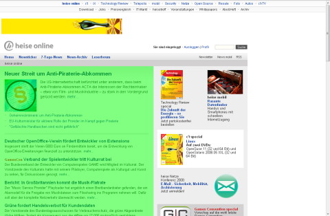
This is how the website now looks on my not-so-gigantic 1280×1024 screen. I took the liberty of highlighting the actual content, squeezed in the lower left corner. Some people on the forum are already complaining about a stiff neck from looking to the left all the time while others don’t like the content being so close to the end of the world edge of the screen:

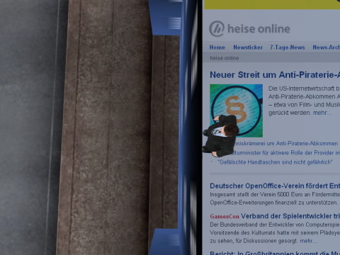
What I dislike most is the odd combination of a centered upper navigation bar with a main content area justified to the left. It makes me feel seasick:

There’s also the large unused white area to the right which is making readers nervous because they expect annoying flashy ads to appear at any time (the medical term is “ad premonition disorder”).

Having studied 2534523 comments, I managed to identify certain patterns in behavior:

  • “It’s not a problem if you can fix it”: These folks suggest you manipulate the css to get the beloved liquid layout back. They probably use Linux, so they’re used to fixing everything they don’t like.
  • “Couldn’t you give users an option, maybe a switch in their profile which would let them choose their preferred layout? Hey, I might even be willing to pay for it”: Windows users.
  • “You’re not supposed to expand your browser to the full size of your monitor. A good OS wouldn’t encourage you to do this!”: Smug Apple 30″ cinema display owners.
  • “I hate you and I’m not coming back… at least not until tomorrow, but I’ll just return to see if you changed the design back and to post angry comments if you didn’t”: They’ll never leave and they know it.
  • “Hey, finally something I can write about in my blog!”:Yeah, that’s… uhm… me.

This would normally have been the end of this post, except that I had an epiphany when I turned my monitor by 90Β° (it’s fixed on an Ergotron monitor arm and my graphics card supports this, too). This changed everything! All those print media sites like SPON, sueddeutsche.de, faz.net and even wort.lu suddenly looked great! I wonder why…

“Hey, it looks good on my screen!” (the one on the left). πŸ˜‰

Totally awesome furniture (and other stuff that you can’t buy)

One of my brothers sent me this link to John Nouanesing’s catalogue after seeing one of his designs on Ehrensenf (the German version of Rocketboom).

Me: “Too bad you can’t buy anything :(”
Brother: “I thought you had some contacts in China, this stuff is screaming to be sold”
Me: “Wouldn’t that be… you know…”
Brother: “Capitalism? ;)”

He’s studying law, BTW (and just to make sure this doesn’t come back to haunt him when he’s about to be nominated to the European Court of Justice or something like that, let me point out that we were kidding and that it’s now 5:45 AM in Ningbo and nobody’s in the factory to pick up the phone, anyway).

The morally immaculate way is – of course – to look at the designs and let their total awesomeness* inspire your creativity.

*I don’t think I’ve ever used “total awesomeness” before, so you’d better take a look. πŸ˜‰