This is what happens when your website sucks

Here’s the first page of “search hits” from my three private blogs (hypermegaglobal.net, meltdownblog.com and krise.hypermegaglobal.net – all updated much more frequently than this one):
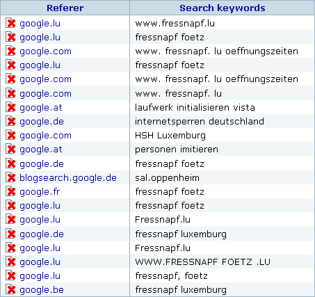
Search hits and keywords
All of these are from today

As you can see, most of my visitors where looking for fnapf, which is a pet supply franchise chain. That’s because I blogged about how badly fnapf‘s Luxembourgish website sucks. Not only is it configured in a way that omitting the “www.” will get you nowhere, even if you make it to their website it’s difficult to locate their biggest store unless you know where to find it on a map (or keep zooming out). This quickly became the most popular post on my blog (pathetic, I know) which means that I’m obviously not the only one who had trouble finding what I wanted on their site.

So here’s a quick reminder of the very basic content you should put on your website (examples are geared towards a brick and mortar store).

The 5 friggin’ Ws – things you should definitely put on your website

Let’s simply take the well-known 5 Ws from journalism and reinterpret them from the perspective of a website visitor looking for information (which should also get us pretty close to the perspective of a search engine trying to determine your website’s ranking). Apparently these basics are so obvious that they’re often forgotten (either that or many people just have no clue of what to put on a website).

Who?

Who are you? Example: We’re “Zombie Megastore”, Luxembourg’s leading store for all you zombie needs.

What?

What exactly is it that you do? Example: We carry a large selection of… well, maybe I shouldn’t have chosen the zombie store example. Anyhow, here’s where you list the things customers can find in your shop so that 1. they’ll find you when searching for your city + a certain item or brand on a search engine and 2. they don’t have to call and ask if you sell product XYZ item before taking the trip to your store.

When?

Opening hours. If you’re closed on certain days, put this on your website. If you’re closing your shop for vacation, put this on your website (yes, I’m looking at you, Luxembourgish shop and restaurant owners who like to take long summer vacations).

Where?

Your address (you might want to include your phone/fax number, email, link to contact form, etc.).

Why?

This is the place where you might think you’ll have to come up with a wonderful story to justify why you’re doing what you do (“when my grandfather turned into a zombie, I realized there was no shop where I could buy thinks to make his… uhm… ‘life’ just a bit better”). That’s cute, but I suggest staying with the customer perspective and just answering the old basic “why should I buy from you”-question. It can be as simple as “we are the biggest store for zombie supplies in the entire state”.

That’s it, the basics. Of course a website can do much more than just answering these questions, but not answering them means you’ll lose potential visitors/customers every day.
Websites with and without ‘www’

Double-u double-u double-u is one of the few things you can say much faster if you say it in German (just say “v v v”). I’m German, so I continuously strive for efficiency (nah, possibly I’m just lazy), which is why it annoys me that I still have to type “www” in front of some domain names to get to the desired website!

I mean, it’s 2008, the World Wide Web has been around for a while, so please, dear webmasters, could you make sure that your website works as http://www.example.com and http://example.com?

Here’s a list of offenders from the past few days (off the top of my head):

Now before you leave a comment and say “why don’t you just use bookmarks or press Ctrl-Enter in Firefox”, let me point out that there’s more to consider: If you can actually reach the same content with and without “www”, so can the search engines. Different URIs for the same resource might mean trouble (“duplicate content”).

AFAIK, the best way to handle both issues is a 301 (permanent) redirect. On Apache, make sure the domain with and without “www” points to the same directory and place an .htaccess file with the following content there (requires mod_rewrite):

RewriteEngine On
RewriteCond %{HTTP_HOST} ^example.com$ [NC]
RewriteRule ^(.*)$ http://www.example.com/$1 [R=301,L]

This will redirect users to URL with “www”. BTW, this code was taken from the excellent book “Building Findable Websites: Web Standards SEO and Beyond” [affiliate link]. It also has a chapter about weblogs which I think I should read. 😉

Chiropractors “very satisfied” with heise.de redesign

Update: Heise made some modifications while I was writing this post, so not everything below still applies.

It’s summer time in Europe, many people are on vacation, others are distracted by the Olympics – if you were planning something outrageous, now might be a good time to get away with it. No, I’m not talking about Georgia, I mean the redesign of heise.de, Germany’s IT website no. 1.

Heise.de went from a table-based, liquid layout to a xhtml 1.0 strict compliant fixed width (elastic) layout. I don’t think anyone complained about the xhtml compliance, the key here is “fixed width”. Yes, I know. Discussed to death. In the left corner, we have “long lines are hard to read” and “fixed width gives you better control over the layout, making it easier to design visually appealing sites for lazy designers like me” whereas in the right corner we have “liquid layouts adapt to all sorts of different screens, which is what the internet is all about” and “if I believe the lines are too long I can resize my viewport myself, thank you very much”. I can’t tell you who’s right (because it’s one of these annoying “many shades of grey” topics) but what I can tell you is that switching from one camp to the other is going to make many people unhappy. Very unhappy.

2 billions. That’s the number of unhappy comments in heise’s discussion forum. Ok, it’s more like 5000 and only about 90% of those express disapproval. Still, even if you consider that the heise forum is most likely the place in cyberspace with the highest concentration of negativity, that’s a lot of unhappiness.

Is it justified? Well, judge for yourself. Or just let me tell you: yes! Let’s have a look at how they messed it up:

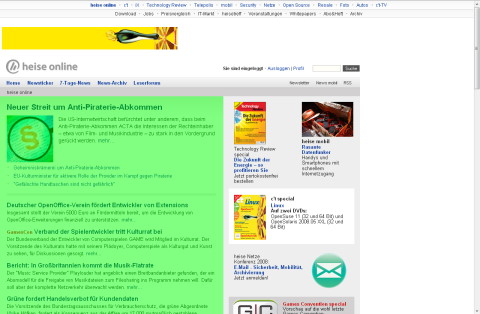
This is how the website now looks on my not-so-gigantic 1280×1024 screen. I took the liberty of highlighting the actual content, squeezed in the lower left corner. Some people on the forum are already complaining about a stiff neck from looking to the left all the time while others don’t like the content being so close to the end of the world edge of the screen:

What I dislike most is the odd combination of a centered upper navigation bar with a main content area justified to the left. It makes me feel seasick:

There’s also the large unused white area to the right which is making readers nervous because they expect annoying flashy ads to appear at any time (the medical term is “ad premonition disorder”).

Having studied 2534523 comments, I managed to identify certain patterns in behavior:

  • “It’s not a problem if you can fix it”: These folks suggest you manipulate the css to get the beloved liquid layout back. They probably use Linux, so they’re used to fixing everything they don’t like.
  • “Couldn’t you give users an option, maybe a switch in their profile which would let them choose their preferred layout? Hey, I might even be willing to pay for it”: Windows users.
  • “You’re not supposed to expand your browser to the full size of your monitor. A good OS wouldn’t encourage you to do this!”: Smug Apple 30″ cinema display owners.
  • “I hate you and I’m not coming back… at least not until tomorrow, but I’ll just return to see if you changed the design back and to post angry comments if you didn’t”: They’ll never leave and they know it.
  • “Hey, finally something I can write about in my blog!”:Yeah, that’s… uhm… me.

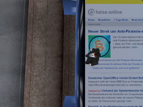
This would normally have been the end of this post, except that I had an epiphany when I turned my monitor by 90° (it’s fixed on an Ergotron monitor arm and my graphics card supports this, too). This changed everything! All those print media sites like SPON, sueddeutsche.de, faz.net and even wort.lu suddenly looked great! I wonder why…

“Hey, it looks good on my screen!” (the one on the left). 😉

Thin borders fade automatically in Firefox

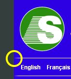
First time I noticed this: The div with the logo and the language selection div below have a 10px solid left border in blue (matching the background color) and a 1px white bottom border, which leads to a nice gradient in Firefox 3:

Nice, though I wonder if this behaviour can be influenced. In IE, Firefox 2, Opera and Safari it looks like this:

(Before you mention it, I know the language names lack padding in the lower screenshot – my mistake, but unrelated to the issue at hand)

Expression web span lang tags

Does Expression Web (version 1 or 2) add <span lang=”something”> tags (“lang spans”) to everything you type in design view? It nearly drove me crazy with this behavior and the many language-related options in different menus, but after I figured out what was going on I actually came to appreciate this feature (when working on multilingual sites).

Why does xWeb do this?

Try this: Select some text and go to Tools > Set Language and choose – let’s say – Alsatian. You should see xWeb adding <span lang=”gsw-fr”> to your code. This will always happen unless your entire page is marked to be in Alsatian with lang=”gsw-fr” xml:lang=”gsw-fr” in the html element or using <meta http-equiv=”Content-Language” content=”gsw-fr” /> .

So, anytime the language of some text on the page does not match the language for the entire page, xWeb adds the lang spans.

BTW, you can set the meta tag by going to File > Properties > Language > Mark current document as though it seems the language information specified in the html tag takes precedence over the meta tag when xWeb decides on adding the lang spans (thanks to Cheryl D Wise for the link to the W3C FAQ and to MrMox for pointing out that the meta tag alone doesn’t always solve lang span issue).

This doesn’t explain why xWeb adds the spans when I just type text on my keyboard!

It appears that whenever you type something, xWeb checks the input language your system is using and sets the language of your text accordingly. This means you get the same result as if you were to select Set Language from the Tools menu, triggering the same effect as described above: If the input language doesn’t match the document’s language, xWeb adds lang spans.

How do I switch this off?

Unfortunately, there doesn’t seem to be a simple “never add lang spans” option. You can find some possible answers on the web (e.g. here and here), but they didn’t work on all of our systems.

So what do I do? Type only in code view?

I don’t recommend this as you might make mistakes with html entities (like typing & instead of &amp;). Instead, go to your Windows Control Panel > Regional and Language Options > Languages > Details and make sure that all input languages which are specified on your page are available (otherwise, add them).

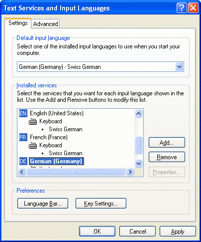
Example: In my company, we’re working with Swiss-German keyboards on websites which are mostly in English (en-us or en-gb), German (de-de) or French (fr-fr):

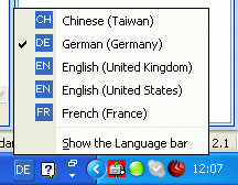
Now when I edit a page which is in German, I just have to make sure that the correct input language is selected:

Voilà, no more lang spans! Furthermore, if I wanted to add some text in English, I could simply switch the input language and xWeb adds the lang span, which means I can easily check the spelling on a page with multiple languages (and voice browsers should pronounce the text correctly, too).

Is that all?

No, it gets even better! If you’re editing an existing page where the language has been set, you can go to Tools > Page Editor Options > General and select Automatically switch keyboard to match language of surrounding text. Expression Web should now select the right input language automatically for you (hey, this saves you two mouse clicks!).

Wait, it still isn’t working!!

All right, I got this working on three very different systems, using xWeb1 and 2 as well as Win XP and Vista x64. It’s no longer an issue casing trouble for us, we did, however notice behavior which can only be described as weird (or buggy) from time to time. For instance, it is perfectly possible to have a page were no language meta tag is present (and no language is assigned in the html tag), but a language is nevertheless set under File > Properties > Language.

You could also try experimenting with the language related options below which I haven’t mentioned so far (just don’t ask me what they’re supposed to do) or ask for help on the Expression Web forum:
Tools > Page Editor Options > General > Default Page Language
Site > Site Settings > Language